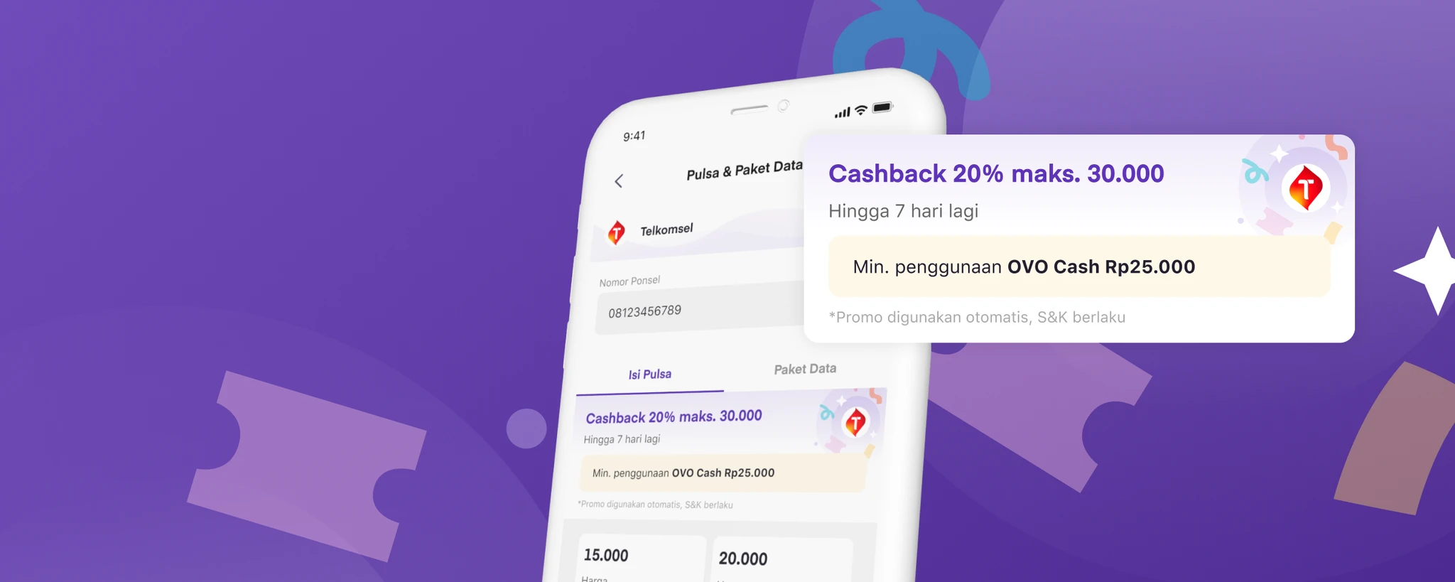

Better Promo Visibility: Increased Transaction & Reduced the Drop-off
We are trying to make the digital goods campaign promotions more visible during the transaction journey to increase their effectiveness.
Responsibility
Craft end-to-end experience, usability testing
Duration
1 Month (March 2022 - April 2022)
Platform
OVO E-wallet is a popular digital payment platform in Indonesia, offering convenient and secure transactions through a mobile application.
Impact 🔥
- Increase transaction value by 10%
- Reduce the drop-off rate on the product booking by 13%.
BACKGROUND
Digital goods transaction numbers have remained stagnant and not grown as expected despite their aggressive promotion.
Based on research results, many users are not aware of ongoing promos because they rarely check our banner section and dedicated promo page. The information displayed in these sections is too broad and requires extra cognitive load to understand.
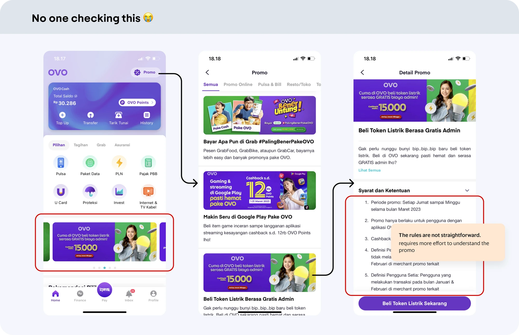
STATE & CONDITION
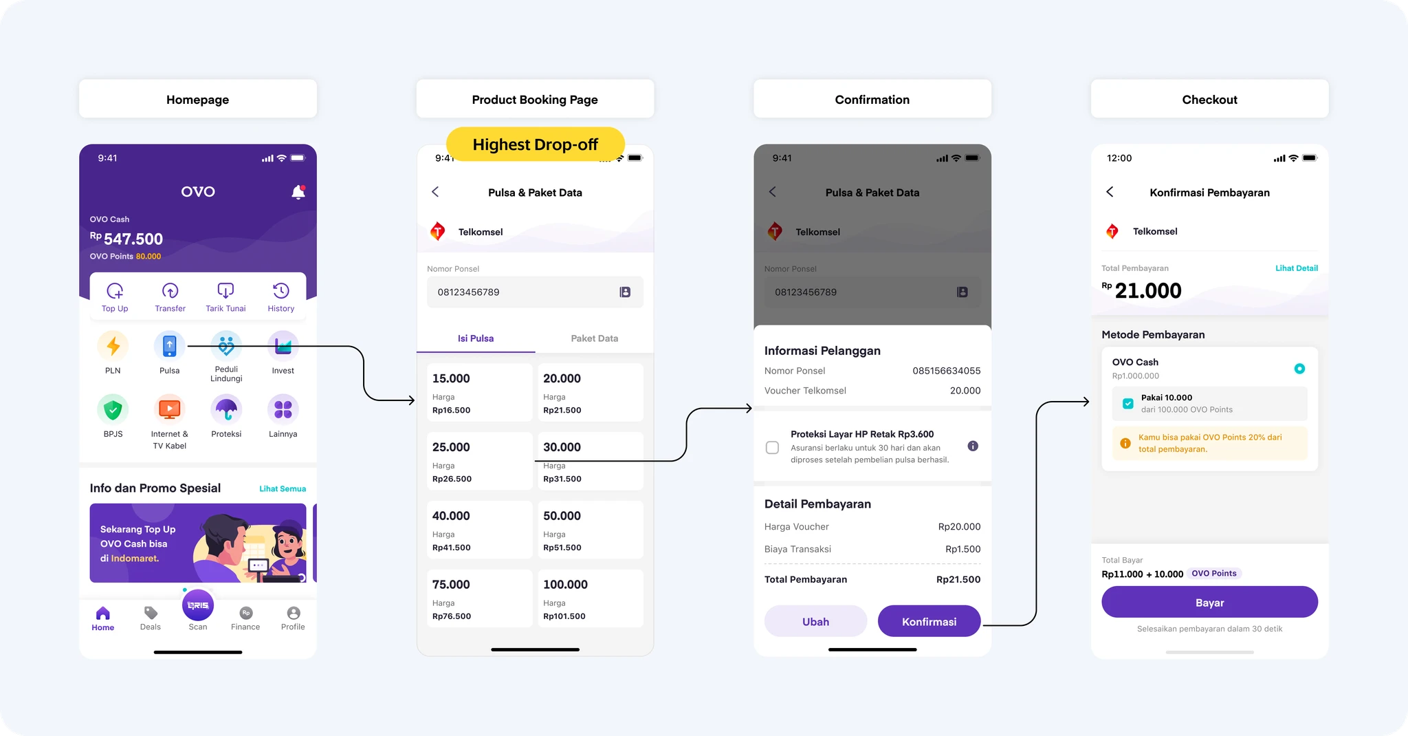
Our current digital goods journey does not provide any promotional information.
The current capability of rewards in digital goods is auto-applied cashback, meaning users do not need to do anything to receive cashback as long as they fulfill the promo rules. However, this condition causes many users to be unaware of the existence of our promos. Therefore, even if we run an aggressive promo campaign, it may not result in a significant increase in transactions.
PROBLEM
After conducting research and analysis, we have concluded that there are several problems.
Users unaware of ongoing promos
This is crucial because it is one of the reasons why our metrics fail to improve.

Product booking has the high drop rate
Many users close this page and do not proceed with the transaction.
CHALLENGE & PROJECT GOAL
Business team has already set the promo for next month!
Here is one of the challenges I face in this project: if the product team wants to help the business team, I need to create a solution as soon as possible because the business team has already set the promo for next month, and they also have a number they need to achieve. If I stay idle or spend too much time thinking of an advanced solution, the same mistakes will keep happening.

In that sense, the project goal is...
How might we increase promo visibility and reduce the drop-off rate to boost Digital Goods transactions with minimal effort?
COMPETITIVE ANALYSIS
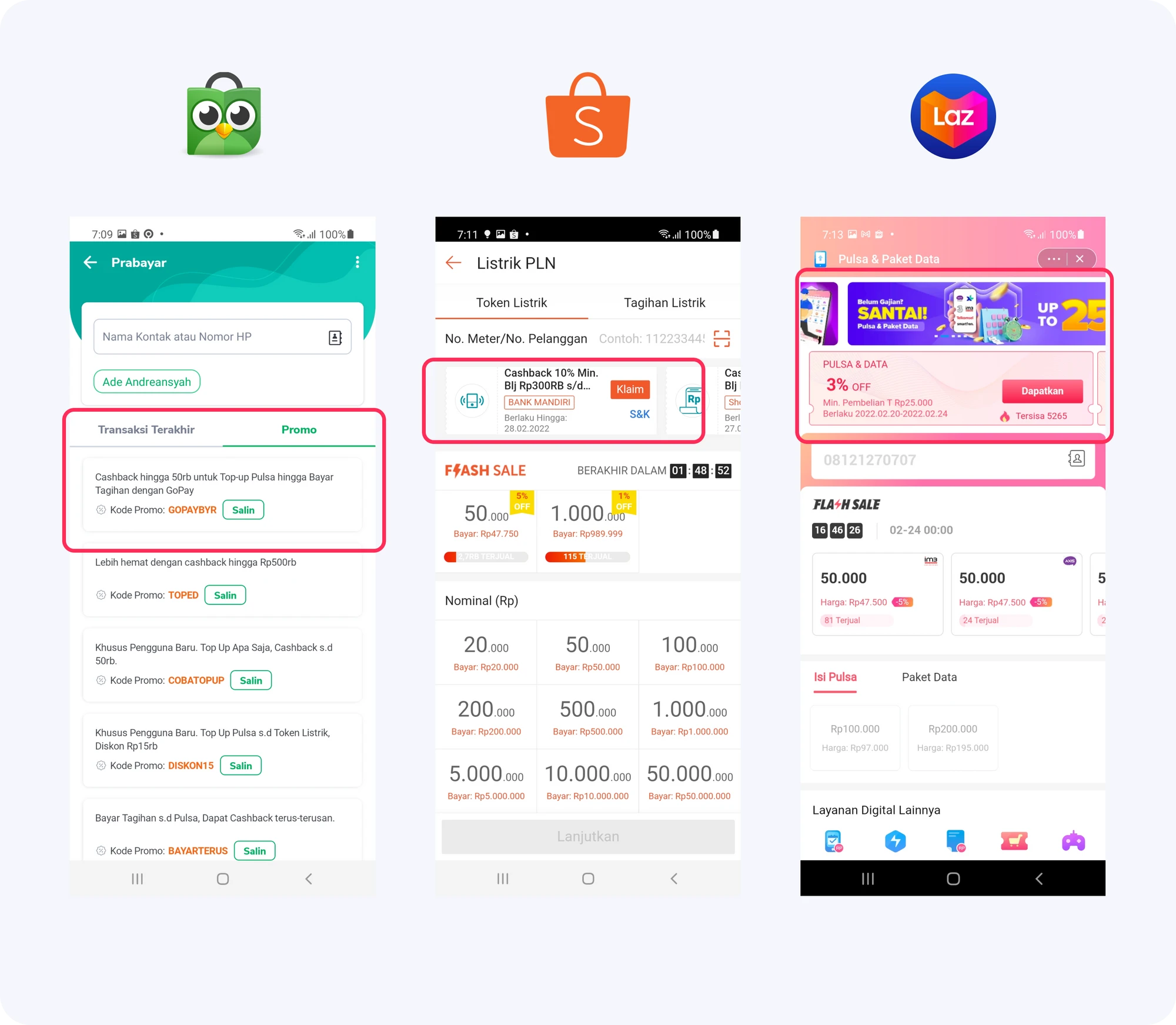
Competitor's digital goods page has similar pattern with prominent display of promos
After assessing the current project situation, I decided to conduct a competitive analysis to draw inspiration and identify design patterns that are familiar and intuitive for Indonesian users.
Takeaways
Here are several points that we can take from the competitor:
- Display promos compactly for user understanding.
- The displayed information usually includes potential cashback amount, validity period, and rules.
- Attractive visuals attract users to read promo.
SOLUTION
Provide clear promo information as early as possible
Our approach is to provide straightforward promo info as early as possible, in order to encourage users to initiate and successfully complete transactions.
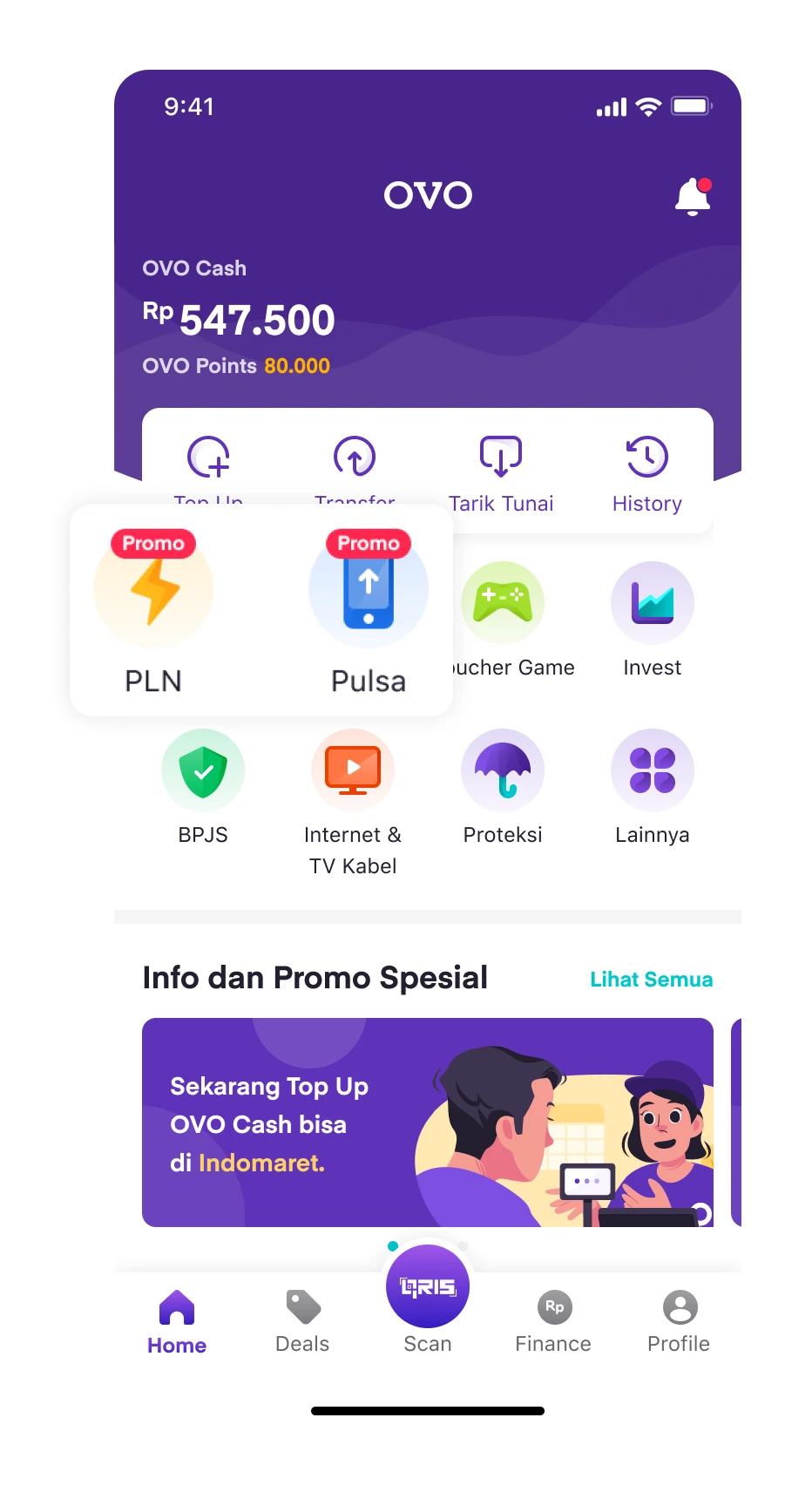
Promo Badge
This promo badge aims to provide information that OVO has campaign promos for digital goods such as phone credit, PLN, etc.
Main Goal ✨
Boost promo visibility to prompt immediate or future transactions. Future transaction means users expect OVO's digital goods to have promotions, so they check later.
Promo Card on Product Booking Page
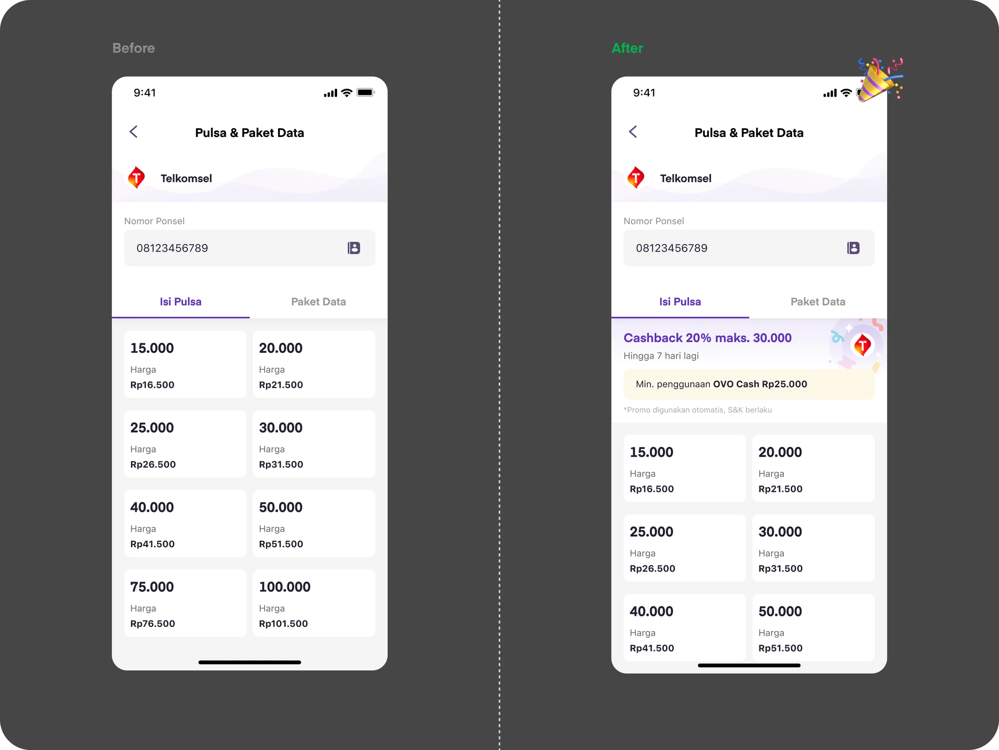
We want to provide promo information as early as possible, and this page makes the most sense because it is present at the beginning of the step and is a place for users to consider their transactions.
Problem Solved ✨
This page experiences a relatively high drop-off rate, we have also decided to place a promo card on the booking page to improve promo visibility and encourage users to continue with the transaction.
DESIGN ITERATION
Designing for Speed and Scalability
With a very short development timeline, I need to design something easy to develop, scalable, and visually appealing to attract users.
Iteration 1: Using Existing Component
To speed up development, I tried using the existing promo component. The problem is, visually, it’s not appealing and doesn’t achieve our design goals.
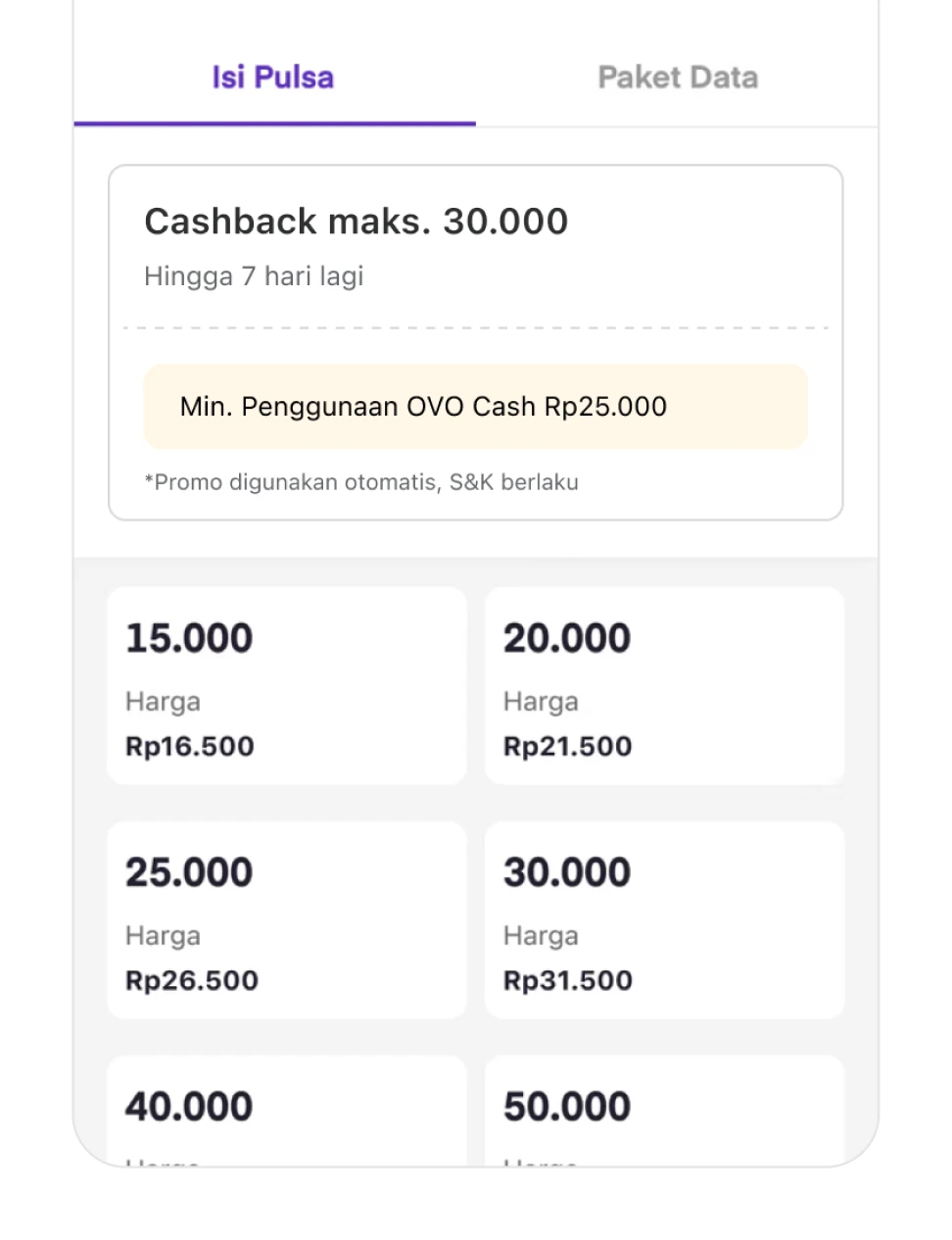
Iteration 2: Make It More Attractive
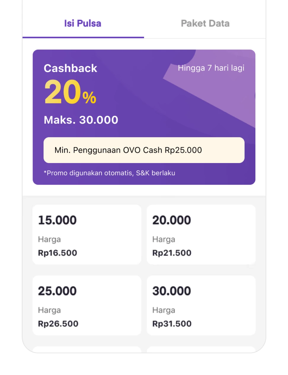
In the second draft, I explored different colors and illustrations to make it more visually attractive. Unfortunately, this approach wasn’t feasible—especially in terms of how the promo value was laid out. It was hard to convey the value clearly when separated like that. Also, it looked clickable when it actually wasn’t.
Iteration 3: Attractive but Still Feasible
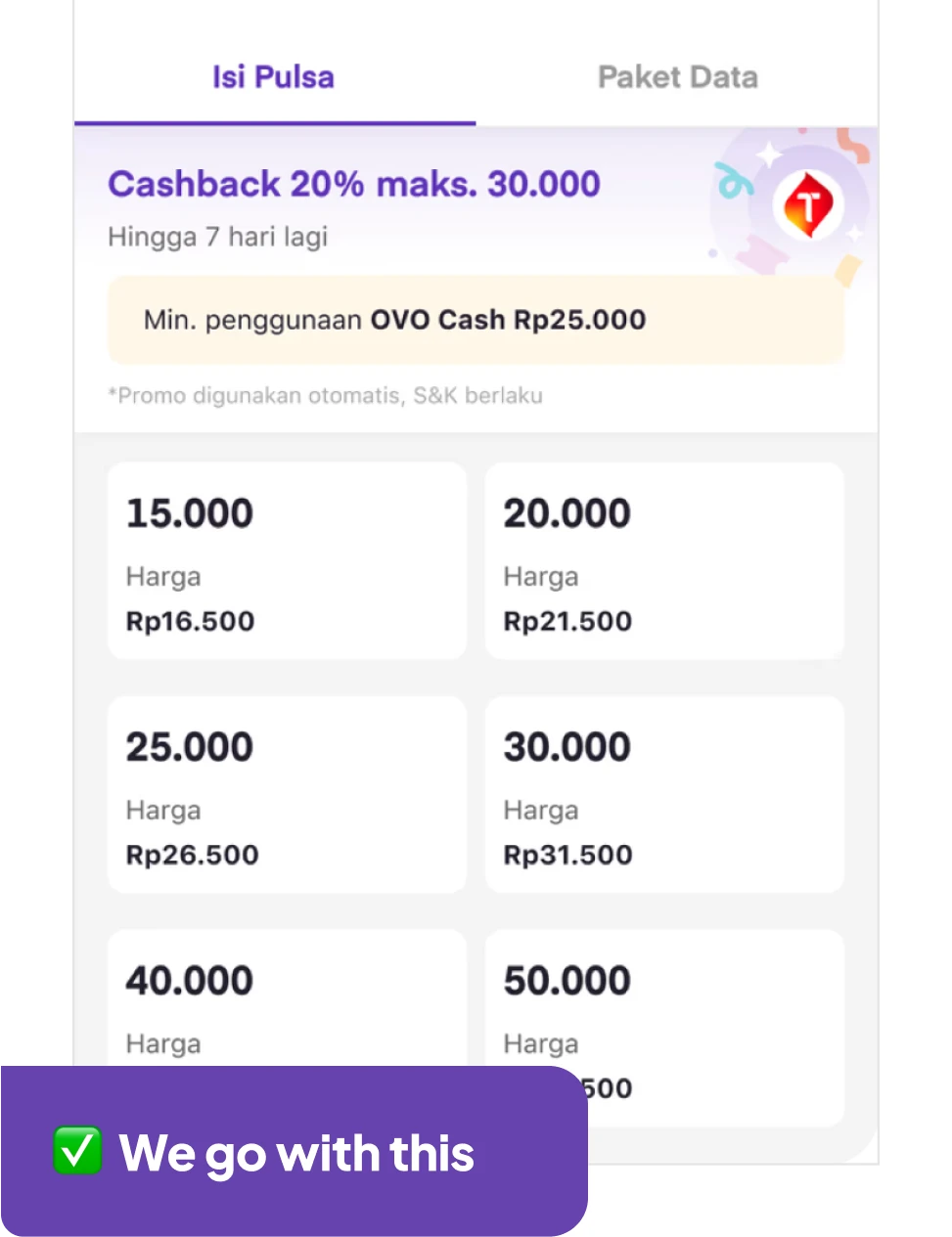
And here it is the final draft. I improved the promo layout into a single line to make it more feasible, made the card full-width, and adjusted the colors slightly to make it look less like a clickable element. I also made it more compact to save space.
DESIGN
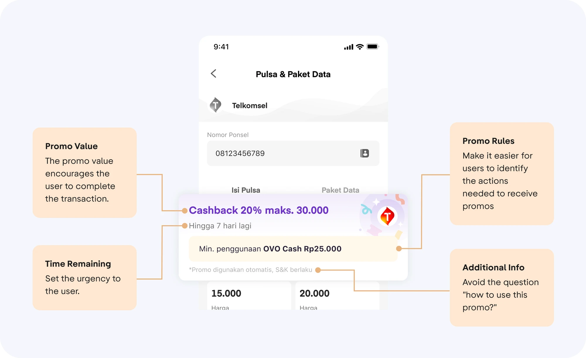
Let's breakdown the design.
Here is a more detailed analysis of the designs I have made.
Promo Card Design
The approach we are trying to use is to attract the user's attention to this promo card by using icons and playing with colors.
DESIGN VALIDATION
Usability Testing
Even though there weren't too many design improvements, we decided to conduct usability testing with the scenario "Imagine you want to get a promotion when you purchase credit on OVO". This is the objective of the usability testing:
AWARENESS
Ensure users aware understand how to use the promo.
USABILITY ISSUE
Ensure users understand the promo rules.
USABILITY ISSUE
Find out whether users have the expectation that this banner can't be clicked.
USABILITY TESTING RESULT
Insights Summary
To be honest, we did not find anything particularly interesting in the usability testing in this case. Everything went very smoothly with almost no issues.
Users understand how to use the promo because…..
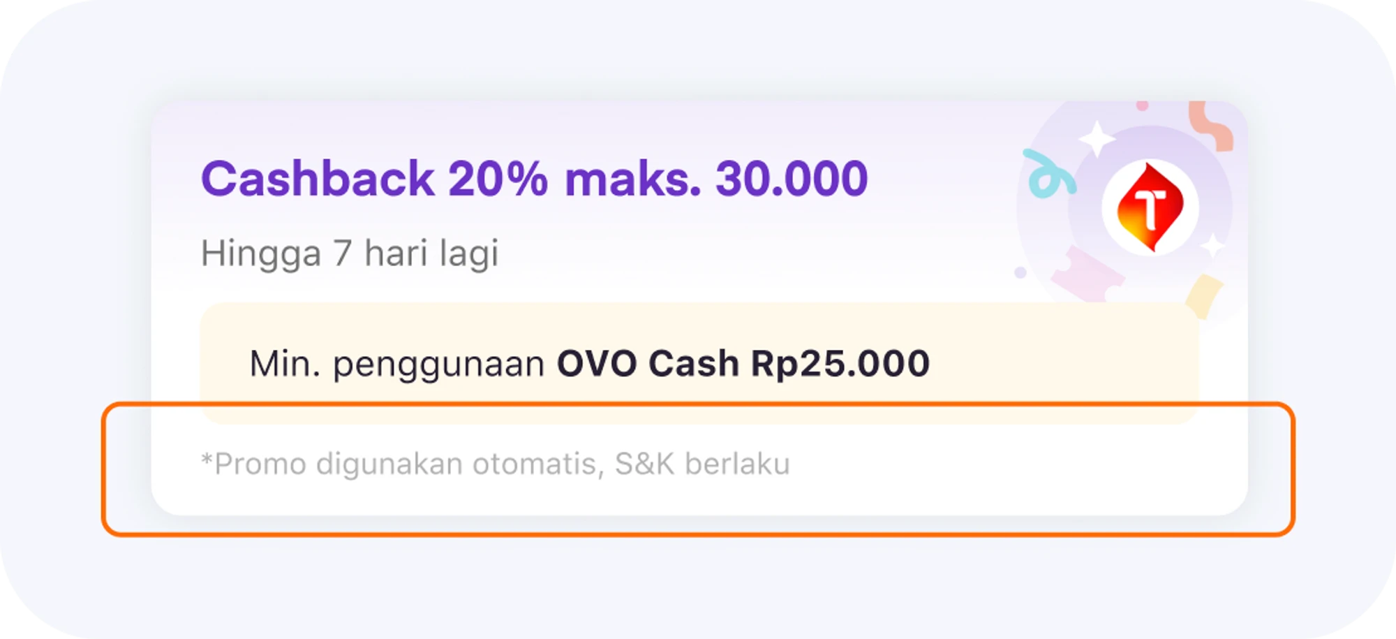
- Inside the banner there is an info that the promo is used automatically.
- In the banner there is no info to enter a promo code or any other things.
"I don't see any information about entering a promo code or similar, and I also see information that the promo is applied automatically." -users
Most participants chose the correct denom because they read promo rules.
"I read the promo rules because the writing is quite clear and prominent" -users
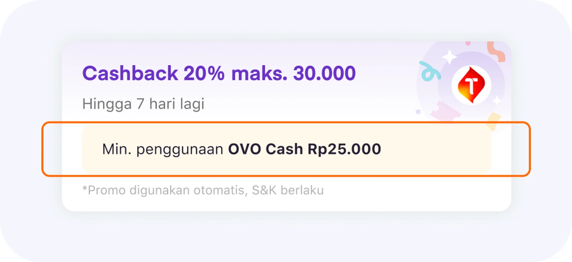
All users don't try to click on the banner because……
they felt that the banner isn't clickable (more like static information) and there are no clickable touch points.
IMPACT
🎉 Increase transaction value growth by 10% & reduced 13% the drop rate in product booking page 🎉
We calculate these metrics by conducting A/B tests on users. Some users are shown the banner when there is a promo, while others are not. As a result, users who see the banner tend to complete their transactions and, overall, manage to reduce the drop rate by 13% and increase transaction value growth by 10%.”
LESSON LEARNED
Quick experimentation in design is very important.
Instead of creating something elaborate that takes a long time, we can run a quick experiment with a smaller scope to see if this improvement works or not. This project only took about 2 months, but we can feel the impact immediately.
To all the designers, project managers, engineers, and other team members who contributed to this project, I extend my heartfelt thanks. ❤️

CHECK OUT MY OTHER WORKS
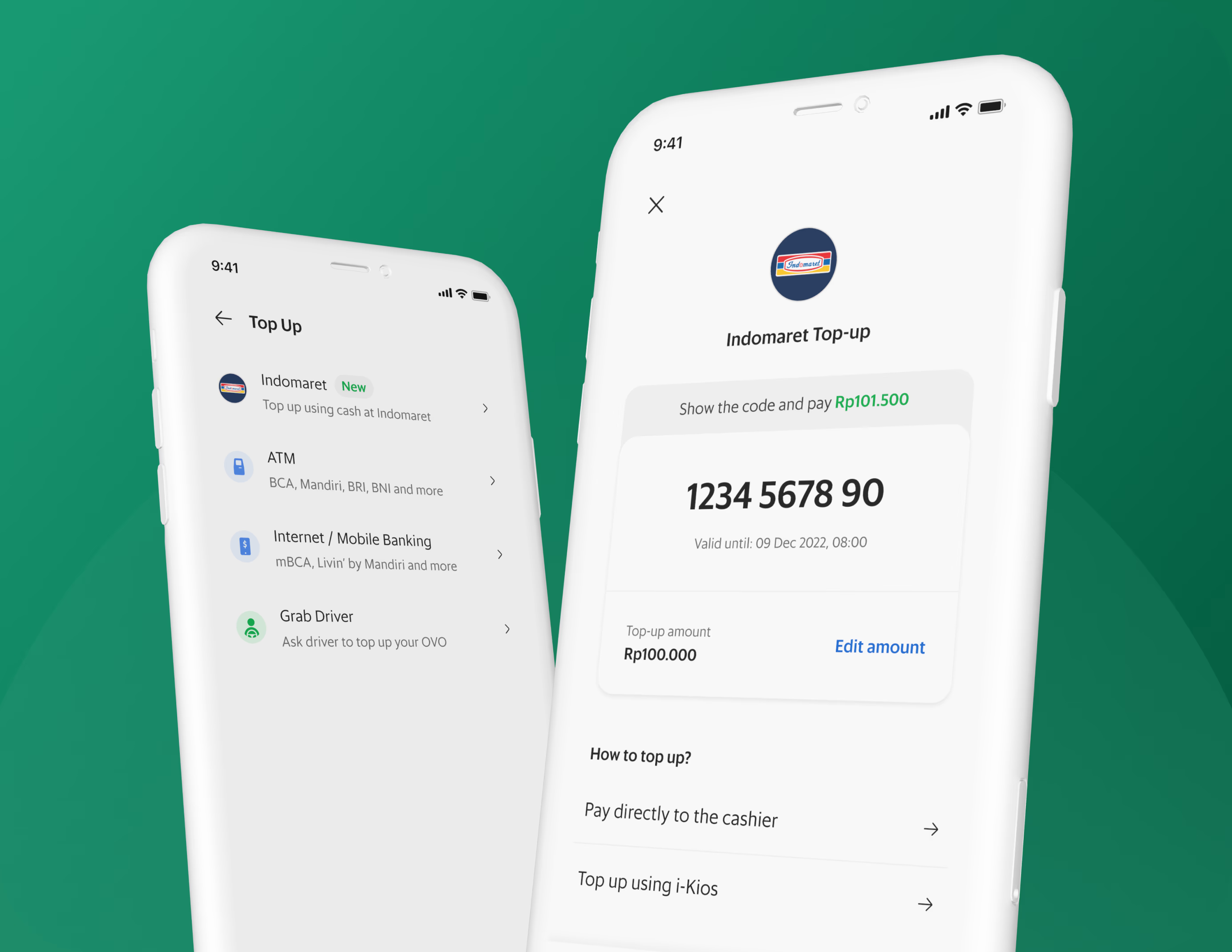
OVO Top Up via Indomaret in Grab Platform
We are experimenting with new top-up methods to eliminate the inconvenience of current top-up channels, which has become a barrier for users.
Read More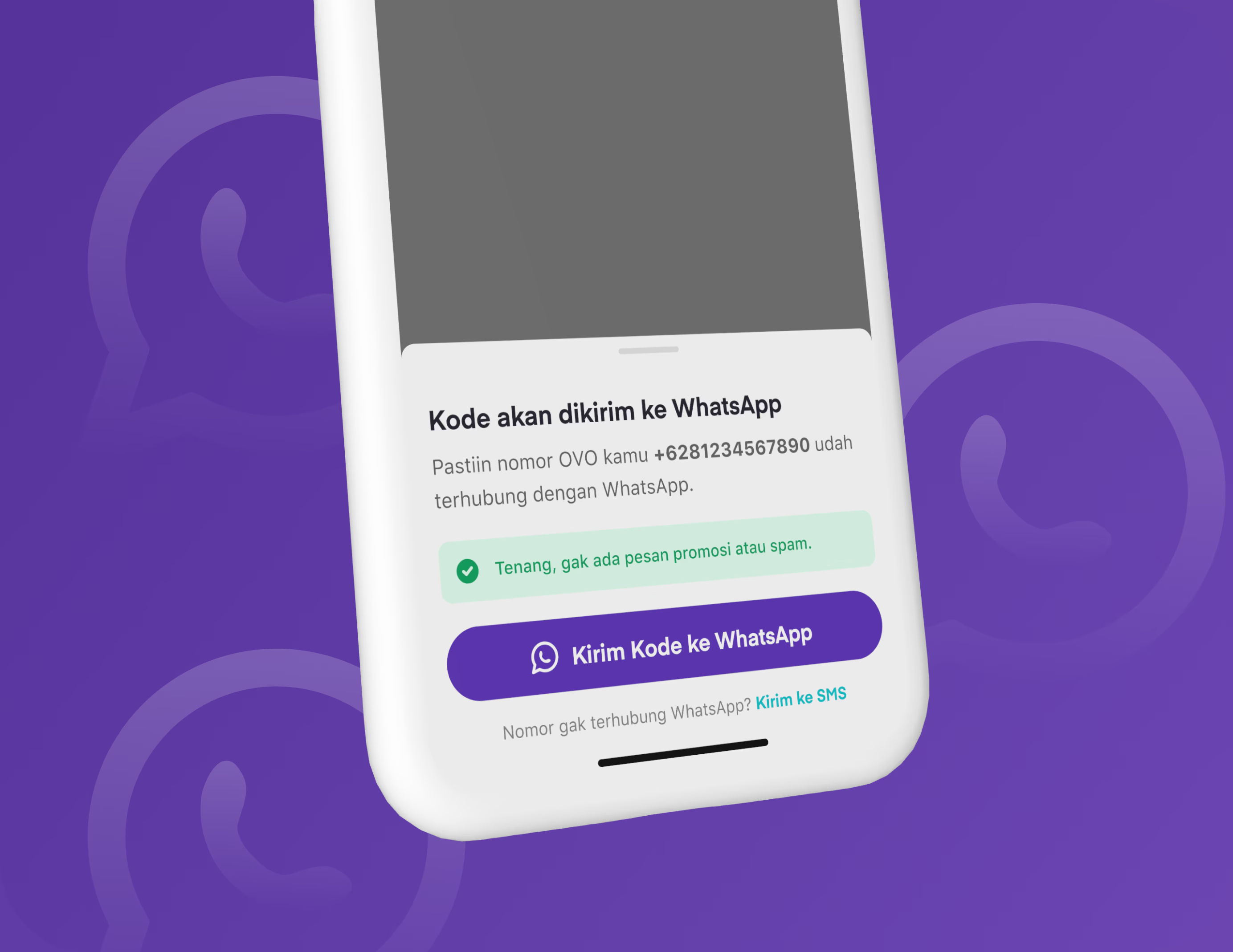
WhatsApp OTP: Reduced Drop-off Rate and Saved OTP Costs
Providing an alternative OTP method. Through this experiment, We were able to reduce the drop-off rate on the OTP page by 48% and save OTP costs by 13%.
Read More